Reimagining the visual identity for a Kuala Lumpur-based carpet cleaning service.
My design process for Cucius, a specialized rug cleaning service in Malaysia, focused on evolving its previous identity as "thecuci" into a cleaner, more focused brand. The core objective was to create a visual system that effectively communicated Cucius's commitment to affordable, high-quality service, utilizing highly technical equipment and non-toxic chemicals safe for all household members.
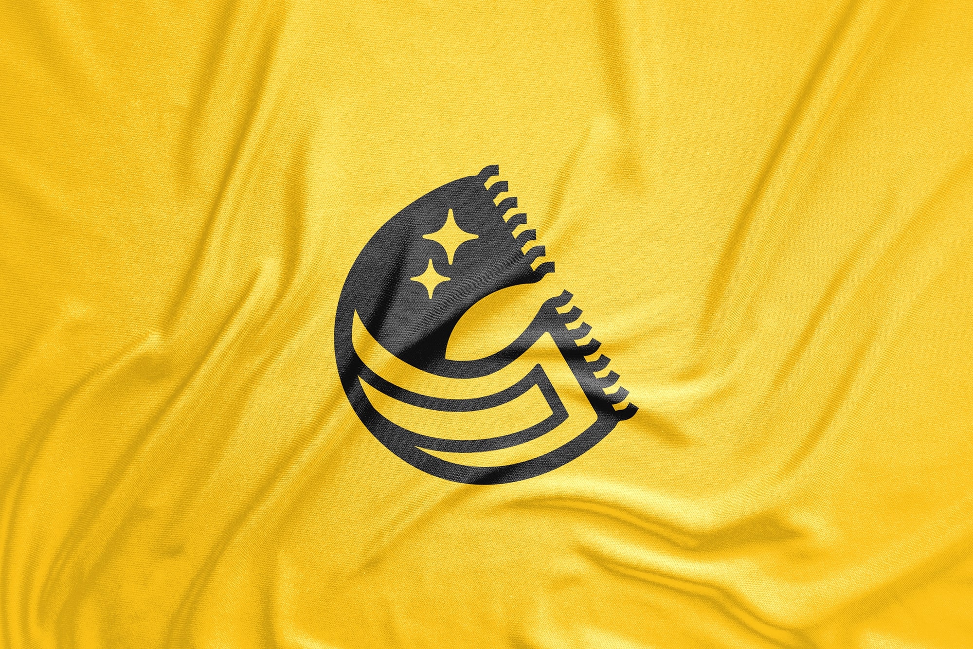
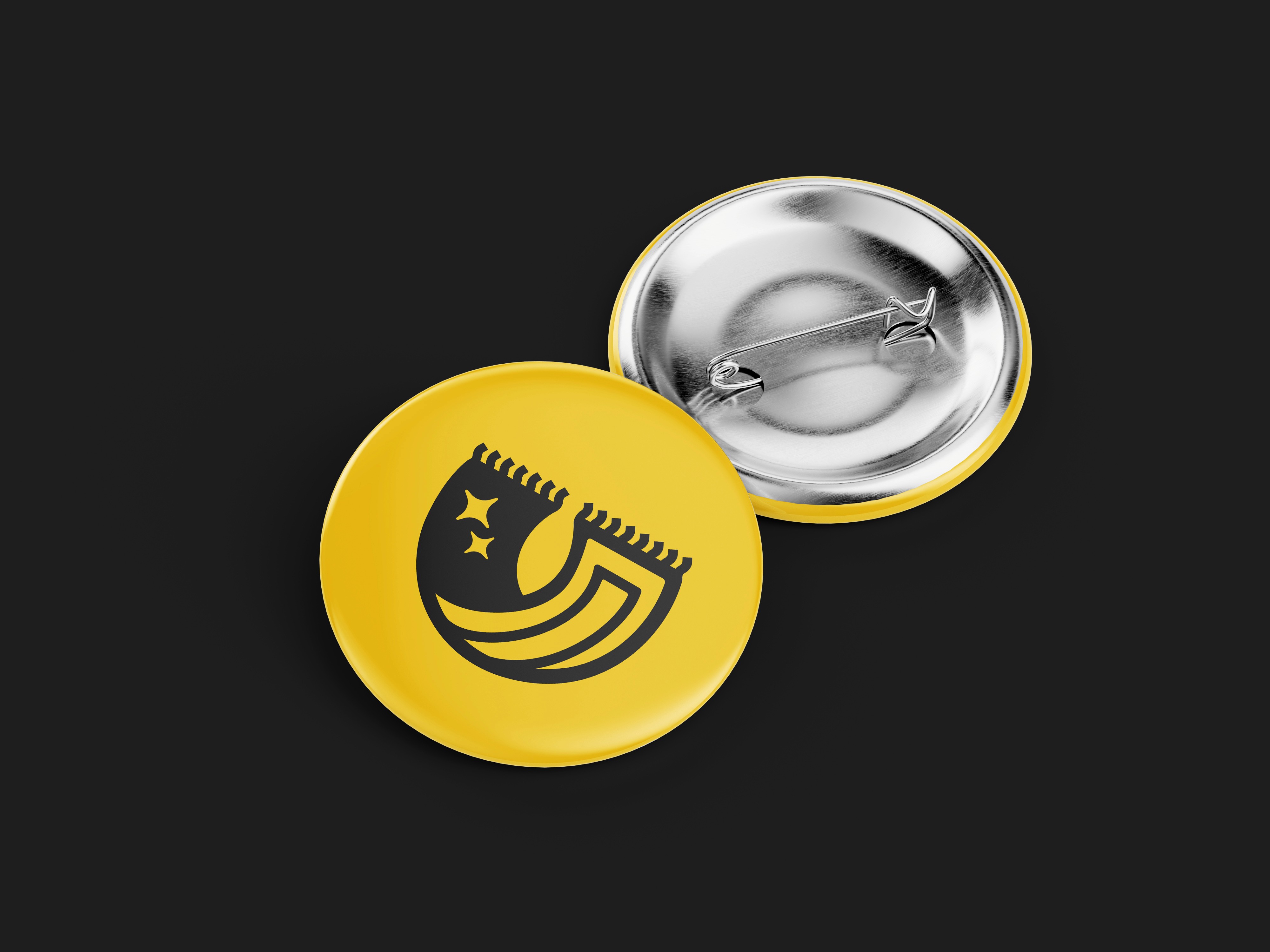
The central concept for the logo involved merging simple yet powerful graphical elements to capture the essence of Cucius's business. This was achieved by ingeniously incorporating a folded carpet shape to form the letter 'C', representing the company's initial, and integrating stars to symbolize thorough cleaning. For the color palette, I retained a familiar yellow hue from the previous brand to maintain recognition, while elevating it to a bolder, brighter shade as a primary brand color. A strong black was introduced as a complementary color, providing sophisticated contrast and enhancing the overall visual impact and versatility of the brand identity across various applications.